
Mungyo Soft Pastels on UART 400 Dark, approx. 8×10″
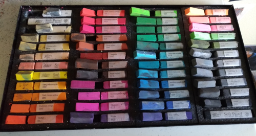
I’m calling this “my experience” since I have used these Mungyo soft pastels only three times, but I wanted to give my first impressions. When Jerry’s Artarama had the 48-piece set on sale, I decided the time was right to try Mungyo.
The sticks came in a nice cardboard box, carefully laid in stiff foam. I peeled off half the paper sleeve from each pastel and broke some of them in thirds, and the rest in half. One stick was already broken in the middle; the rest were intact. Out of 48 sticks, two had some crustiness on the outside that made the pastel skid across the surface instead of laying down color. I scraped that off with my fingernail, after which the sticks worked just fine. Maybe it was a coating of glue from the wrapper; I don’t know. I’ve actually thrown out individual sticks from other brands because they never stopped skidding. These I was able to fix.
Since I had just finished a successful painting on Fabriano Vice Versa (Fuchsia color, laid finish side), I used exactly the same paper for the initial Mungyo test run. I thought the colors in this set might lend themselves to Fall foliage, so I found an image from an early Autumn trip to June Lake in California’s Sierra Nevada. Here’s how that one turned out.
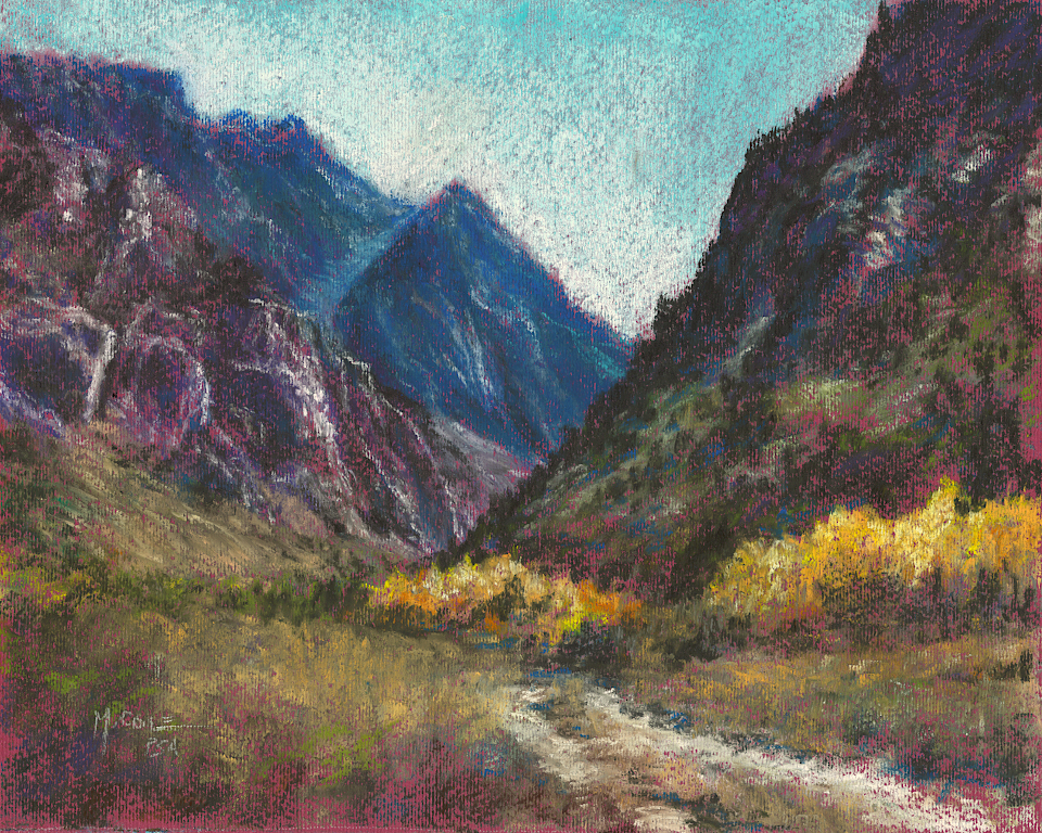
Mungyo Gallery soft pastels on Fabriano Vice Versa, approx. 10×8″
Right from the start, as I blocked in the sky, I was fighting the laid finish on the Fabriano Vice Versa paper. These soft pastels are semi-hard or hard, really–somewhere between Rembrandt and NuPastel, I’d say–so the blue and white I was using didn’t want to fill the tooth. I smeared the entire sky with my finger and then layered both colors on top again. The lightest “Cobalt” blue in this set is still too dark and too Cyan-based for the airiness of the Sierra Nevada sky, so the end result was a compromise.
Having rubbed the sky colors down into the mountain areas, I reestablished the skyline with an eraser. I use this erasing technique often (sometimes to completely wipe off a painting) and this was the first time I noticed any “gumming up” of the erased pastel. I had to be very careful brushing it off so it didn’t get ground deeper into the paper tooth. The erasure was successful; I just had to be more careful than usual with the cleanup.
The Fabriano paper does very well with softer pastels, and the Mungyo are fairly hard, so this paper and these pastels are not as compatible. Since I had arbitrarily decided that the painting would be done with only Mungyo pastels, I ran out of options sooner than I expected to. Things got overworked quickly, and I couldn’t make corrections simply by adding layers. On Fabriano Vice Versa, I found the Mungyo sticks to work best for basic underpainting and hard lines, and for softening edges with a stick instead of with a fingertip.
Having set the baseline with the Fabriano, I tried a surface that might better suit the Mungyo pastels: UART 400 Dark (see image at top). The experience was completely different! These two worked together so well! The dark charcoal colored surface was the perfect foil for Mungyo’s bright palette, and still left room for the dark (quite dark!) black. The terrific consistency of the pastel sticks made working with them a joy. Slight variances in pressure allowed for subtlety or boldness, and left wonderful marks and textures. On UART 400, these Mungyo sticks are a great addition to my other hard and semi-hard pastels (Faber-Castell, NuPastel and Rembrandt), and I fully expect them to be my go-to option for certain sticks in their color range.
Just to try one more paper (and because these pastels were such fun to play with!), I chose a cutoff from a sheet of MingART Standard gray sanded paper (see image, below). Once again, the Mungyo pastels were a joy to use. Layers and marks were easily laid down, and blending with the sticks was easy. I ended up breaking some of the now-half-sticks into quarters and found them easy to use at that size. This makes sense because I’ve been using essentially quarter sticks with my Faber-Castell set.
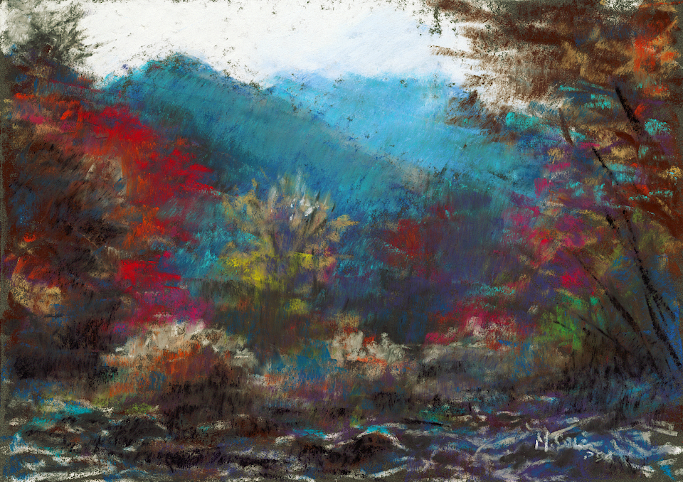
Mungyo Gallery soft pastels on MingART Standard gray, approx. 7×5″
In summary: I’m happy that I got this 48-piece set of Mungyo Gallery pastels. The colors are vibrant, the sticks are consistent, and they work particularly well on sanded papers.
The biggest adjustment for me was the brightly colored palette. My usual landscape palette is considerably darker and leans toward ultramarine and olive (vs. pthalo), and maroon (vs. magenta). The lighter colors in the Mungyo set seemed almost garish at first glance, and I am still learning to use them. (A friend suggested that the bright colors are probably in this set for those who paint flowers or still life, which makes sense.) On a particularly happy note, the cool grays are actually cool, which I appreciate immensely. The black and white are truly extreme, and I am grateful that they provide two sticks of each.
For my own sake, I would replace some of the reds and peachy colors–and all of the fluorescents–with some darker greens and deep maroons and purples. I would also like to have a wider range of truly ultramarine blues, including some very light tints. Hey, if I ever get to have a signature set of Mungyo Gallery Pastels, I will make sure those are in it! The good news is that there was very little overlap with my other sets, so I have easily and inexpensively expanded my palette. I look forward to stretching my color comfort zone and seeing what else I can do with this highly enjoyable set.

Thanks for the report!
LikeLiked by 1 person
Thanks, Susan! I hope it’s helpful. It was sure fun to try them!
LikeLike