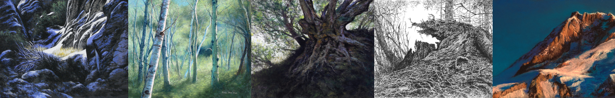
Well, I wanted to compare different pastel papers, and I was graciously given a selection of various brands for just that purpose! Take this “review “with a grain of salt, since the paintings you see here are my first attempts on each of these surfaces. This post is simply my personal experience of trying them. Only after many paintings would one be able to properly compare these brands.
(Go here for my earlier comparison of MingART’s four different types of papers.)
That said, here goes!
(UPDATED 3/31/2022: added UART Dark 400)
Multimedia Panel


Pros
- Nice and stiff
- Nice random texture
- Beautiful cold white color!
- Good for smearing (just go easy so as not to fill the tooth)
- Mostly erasable, nice for pulling out highlights
- Does not pill up or make the pastels “skate,” even after hard use
Cons
- Runs out of tooth fairly quickly
- Hard to cut
- Inflexible, possibly brittle if used in larger sizes; might need mounting
- A bit rough texture for smaller works
My personal take on Multimedia Panel:
I like the stiffness and the random texture of Multimedia Panel, and I’ve seen others do nice work on it. While it’s not as conducive to my usual style of painting in pastel, it might be a good choice if I want a brilliant white base. I like it better than the Canson water media paper I gessoed myself. I expect Multimedia Panel to be quite durable, especially when mounted to a wood panel or foamcore, but that increases weight and size for storage. Unmounted, it seems brittle and I would be concerned that it might chip or break. I’d be interested in hearing the perspective of others who use this substrate regularly.
UART 400- and 500-Grit


Pros
- Initial strokes are clear and definite
- Retains sharp lines
- Wipes/smears very well
- Relatively erasable
- 400-grit takes more layers
- Comparable to MingART Premium
Cons
- Slight laid finish on the 500-grit (could just be my sample)
- Thin sheet tends to curl if not mounted
My personal take on UART:
I found UART 400-grit to be comparable to the MingART Premium paper. The 500-grit was a bit too fine for my style, as it would not take as many layers. Also, while I was able to manage the “laid” finish of the 500, I would prefer not having to do so. The warm yellowish color was not particularly suitable to my style either. I found myself working to cover every bit of it. Since I like to leave a bit of the paper showing whenever possible, I prefer a darker gray, brown, blue or green as a color foil for my landscape pastels. On the other hand, the UART easily achieved well-saturated blues which did not appear greenish, despite the yellow substrate. Given the ease with which UART accepted both pastel sticks and pastel pencils, I’m interested in trying UART’s new “Dark” paper.
UPDATE 3/31/2022: UART Dark 400
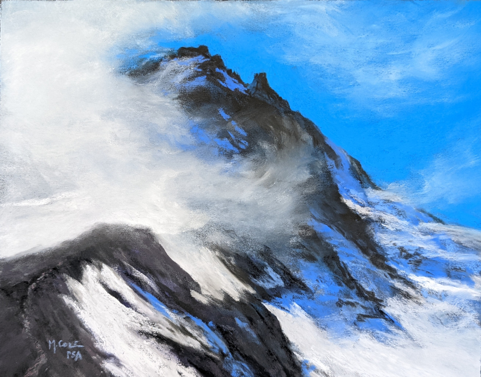
This painting of Mt. Hood was done recently on UART 400 Dark. I’ve been using UART 400 Dark now for a couple of years and I’m VERY happy with it, with one caveat: it definitely has to be mounted to a board to keep from curling up. Once framed, it’s not an issue, but storage is more difficult when the paper curls. Back to the positive side, I love how subtle shifts in pressure can be used to get a range of saturation. Layer after layer can be added, and it takes all kinds of smearing (don’t use your fingertips, trust me!) and erasing. It’s one of the easiest papers to reclaim, too. I’ve erased full paintings right down to the surface leaving almost no ghost image. The tooth remains undisturbed. Current Conclusion: UART Dark 400 is easily sourced in the U.S., and its versatility makes it my go-to sanded paper.
Clairefontaine PastelMat


Pros
- Super-fast application of pastel pencils: just draw
- Blends very well, simply keep painting
- Imperfections in the paper are easily managed
- Allows for sharp lines
- Encourages an oil-like approach (for me, anyway!)
- Decent stiffness, though it still has a tendency to curl
Cons
- Surface mars easily if not stored carefully
- Substrate color can show through (which can be good or bad)
My personal take on PastelMat:
My first impression of PastelMat was “wow, this is EASY!” The pencils just raced across the surface leaving a clear trail of color behind. It felt a lot more like “painting” than it sometimes does with the pastel pencils. I found myself wanted to do more oil-like blending and even impasto. However, it was not particularly conducive to iterative improvisation, turning kind of muddy after a few passes over the same area. The yellow/buff color of my particular sample is not one that I would choose again since it toned everything a bit yellow, despite multiple layers of pastels. For artists who plan ahead more than I do, PastelMat will work wonders! I’d be interested in trying some of their other colors (they have 8).
Sennelier La Carte Pastel Card


Pros
- LOTS of control!
- Nice “feel” to painting on it
- Does not impose any texture, yet has plenty of tooth and randomness
- Blends easily when desired
- Usable range of available colors
- Easily accepts 3 layers without making “mud”
- Ridiculously durable! Takes an amazing amount of abuse and reclaiming!
- Does not pill up or make the pastels “skate,” even after hard use
- Very stiff, easily stored
Cons
- Extra fine detail is best planned ahead
- I have heard it comes apart when wet (though I have not tested this).
My personal take on La Carte:
Sennelier La Carte is now one of my go-to papers! The texture is palpable, but does not intrude on the painting at all. It doesn’t feel like any other paper, and I find the sensation of painting on it quite pleasant. Their gray and brown are excellent color foils for my kind of landscape painting. In comparison to the other papers, the La Carte is particularly suitable to my technique. I often iterate, smearing the initial colors into the surface and then wiping most of it off to make a dry underpainting. The La Carte can handle it over and over again! In fact, on one small sheet I recently did four complete paintings and wiped off every one of them, erasing down to the faintest ghost image each time. The paper was still in good enough shape to allow me to spray it with fixative and paint over it one last time! While it had lost a little tooth, the fixative restored it, and I was still able to paint on it. Unbelievable.
My Two Favorite Papers (at this moment!)
About 8 months ago, I decided to try painting again on a partial sheet of reclaimed Wallis that had been sitting around for years. I finally figured out how to paint on sanded paper. Suddenly it made sense, and I loved it! After receiving some samples of MingART (all 4 types), UART, PastelMat, Multimedia Panel and La Carte, I got a better idea of the range of papers available out there. Some thirty paintings later, I have established a clear preference.
Given my personal style, MingART Premium and Sennelier La Carte Pastel Card are my current favorites. The La Carte is stiffer than the MingART, which makes for easier storage and handling of unframed originals. The colors of both brands are eminently usable. Both papers accept a LOT of layers and allow for excellent control. While the MingART takes and holds a sharper line, the La Carte allows for remarkably subtle blending without abrading one’s fingertips. When it comes to reclamation (obliterating an image so the paper can be reused), the La Carte is king! Vigorous erasure does no damage and leaves a fainter ghost image, and the paper will take as many as four cycles before it needs fixative to restore the tooth.
Again, to be clear: my experience with sanded papers is relatively short, and I did only two small paintings on most of these surfaces. There is a wide range of pastel papers out there. Price is always an issue, and–of course–if the paper is not available in your area, it doesn’t really matter how good it is! I’m fortunate to have good sources for both the MingART and the La Carte. I expect to be painting on these two for quite some time.
(UPDATE, 3 December 2018: I have asked MingART for a new contact email for questions about availability, size, price and color. I’ll post it here as soon as I receive it!)


Interesting review on sanded papers! But wondering what type of paper is Fabriano Elle Erre vice versa that you describe on your instagram work ?
LikeLike
Hi, Mary! I’ll do a review of Fabriano Elle Erre/Vice Versa along with Strathmore’s Artagain Black (neither of which are sanded) soon. Thanks for the question! Quick answer: the Fabriano is marketed as “card stock” and works very well with pastel. The Strathmore is marketed as colored pencil paper and–again–takes far more pastel than one might expect.
LikeLike